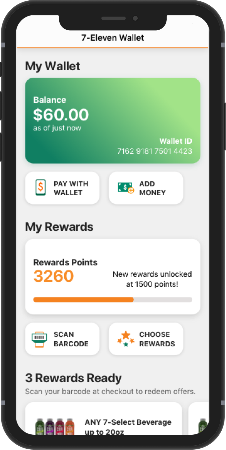
The final screen of the Wallet.
About the project:
This was a new Wallet feature for the existing 7-Eleven app. We wanted to encourage
7-Eleven customers to download the 7-Eleven app,
add money to their wallet, and increase adoption and engagement.
Goal: Design and build a new digital wallet feature in the existing 7-Eleven iOS and Android app.
Role: Lead Designer - responsible for visual design, Information architecture, Interaction design, User research and testing with the UXR, UX writing
Timeline: 14 months
Why did we do this project?
Business Opportunity: Usage of the Wallet would increase loyalty members,
decrease credit card fees, and operational costs related to handling cash.
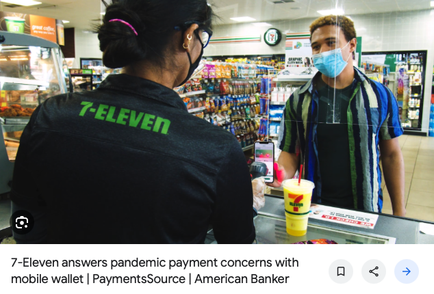
Customer Problem: After the project began we found ourselves in a pandemic.
Contactless methods of payment were in demand, and the Wallet would offer this.
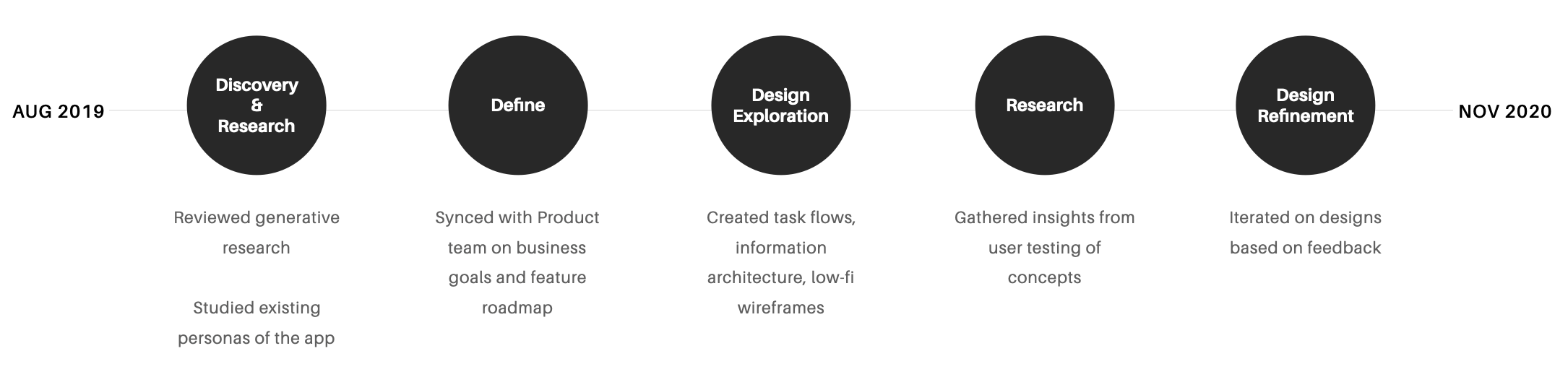
Process
I had the luxury of following this standard user centered design process, and as most of us know, it rarely happens this way!
Design Foundations
After product, engineering, and I discussed the project goals and features roadmap for our MVP,
I started creating task flows, IA maps, and low fidelity wireframes to get sign off with leadership.
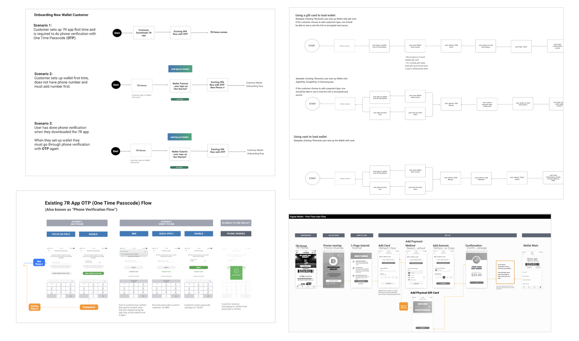
Task flows and low-fi wireframes
What would make a cash customer use the app instead of cash?
Research questions: What types of offers would resonate with customers and motivate them to use the wallet?
Method: Intercept survey of 100 customers in 6 stores over 2 days.
Insights discovered:
- 5% cash back had high receptivity
- Earning points that equal cash had high receptivity
- Adding cash to the app actually had low receptivity
Our initial promo was to give 2,000 points if customers loaded $20 or more into the Wallet.
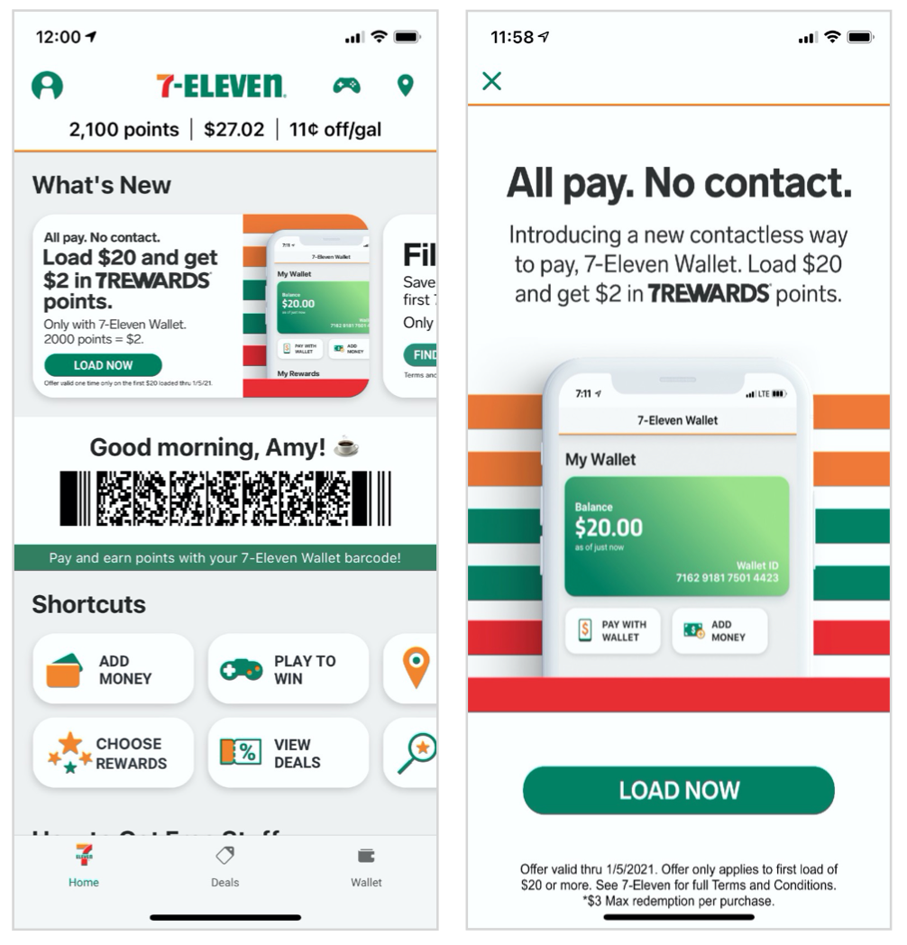
A promo tile on the main screen and an overlay promoting the incentive.
Design Explorations: Select Funding
During onboarding, the customer has to select what funding method to use for their
Wallet. This went through some iterations based on the insights from user interviews and stakeholders.
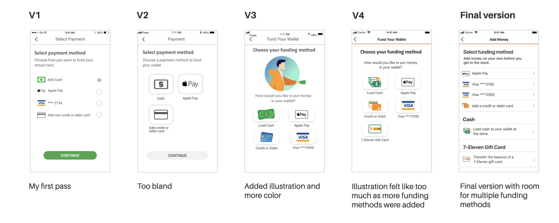
Evolution of select funding process during onboarding. I actually felt in the end that V3 was the most appealing, but the final version tested better.
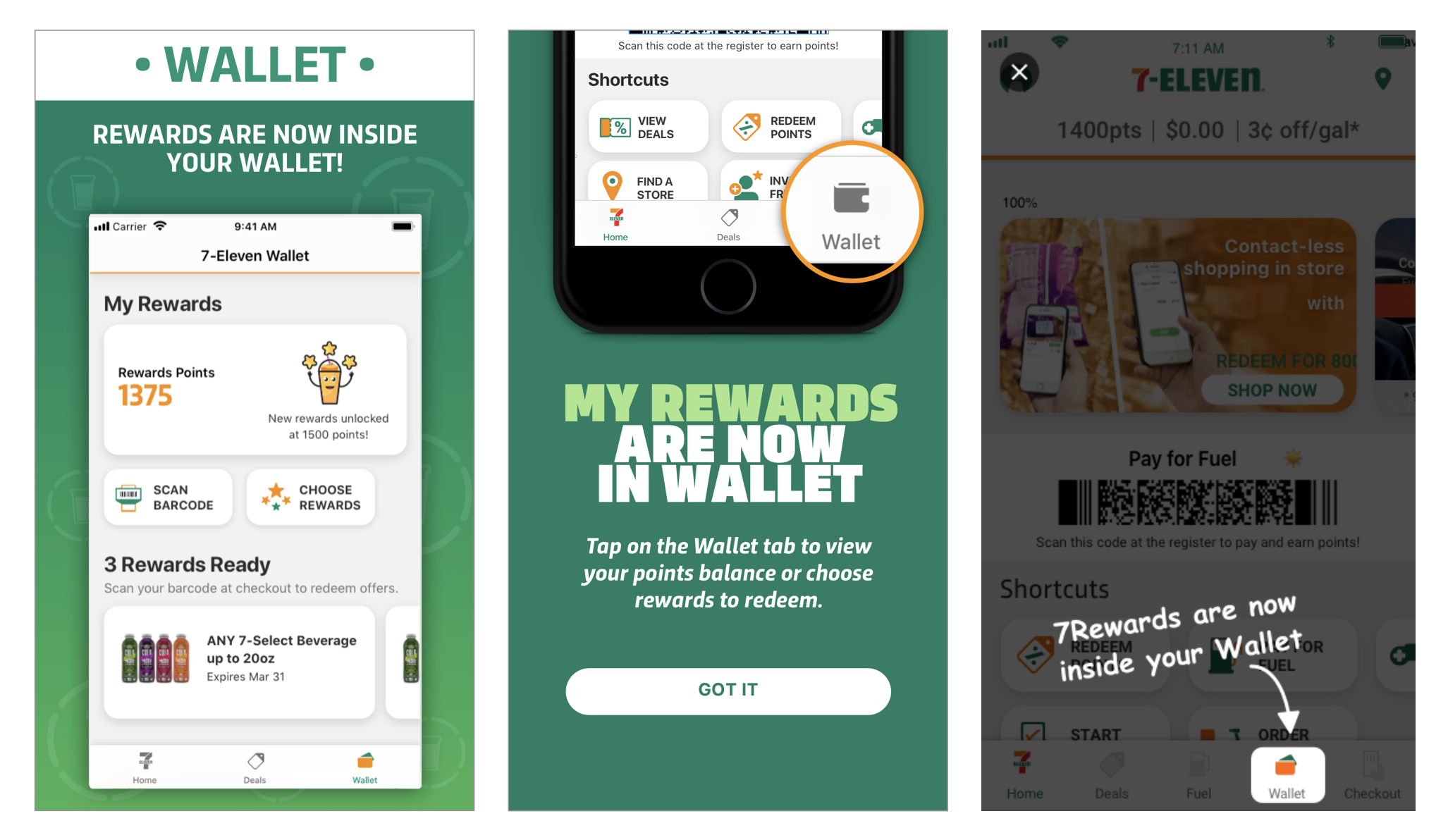
We used overlays, app store notes, and coachmarks to teach users that their 7-Rewards loyalty points were now located in the Wallet.
Users' Mental Model of Wallet Was Like a Physical Wallet
The User Researcher and I planned some remote user testing using UserZoom of some early designs.
During this we learned that customers’ mental model of wallet was the place that held their money,
7Rewards points, coupons, and rebates, like a physical wallet.
So as a result, we moved 7Rewards loyalty points into the Wallet hub.
Design Explorations: Auto Reload
Here are some examples of high-fidelity wireframes in setting up the Auto Reload option.
I tried different messaging to try to encourage customers to set up their
Auto Reload after they’ve set up their wallet.
It is a delight to have a writer to work with, but unfortunately I didn't for this project
so I had to take a stab at the copy myself.
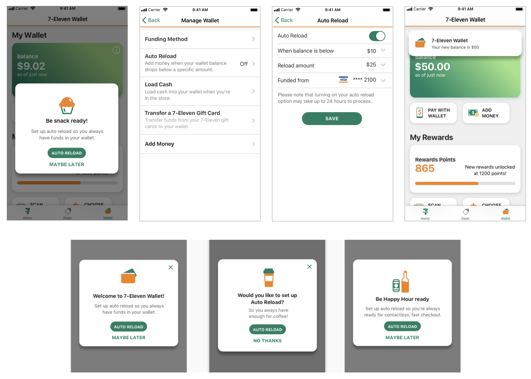
Auto reload explorations and examples of written copy.
Aligning Across App and Store Systems
Research questions:
How does the Wallet work with store associates and store systems?
Method:
Contextual testing in corporate store with team members and store associates.
Results:
The store systems designer and I suggested changes to align on terminology, reduce number of steps, and increase security.
Details:
I created flows to show loading cash and paying for items, from the store system view and the app view.
This helped me to see the entire process for both users and store associates to spot opportunities for how to streamline
the flow. The store systems lead designer and collaborated on changes that we could make to the current and future versions of the store systems.
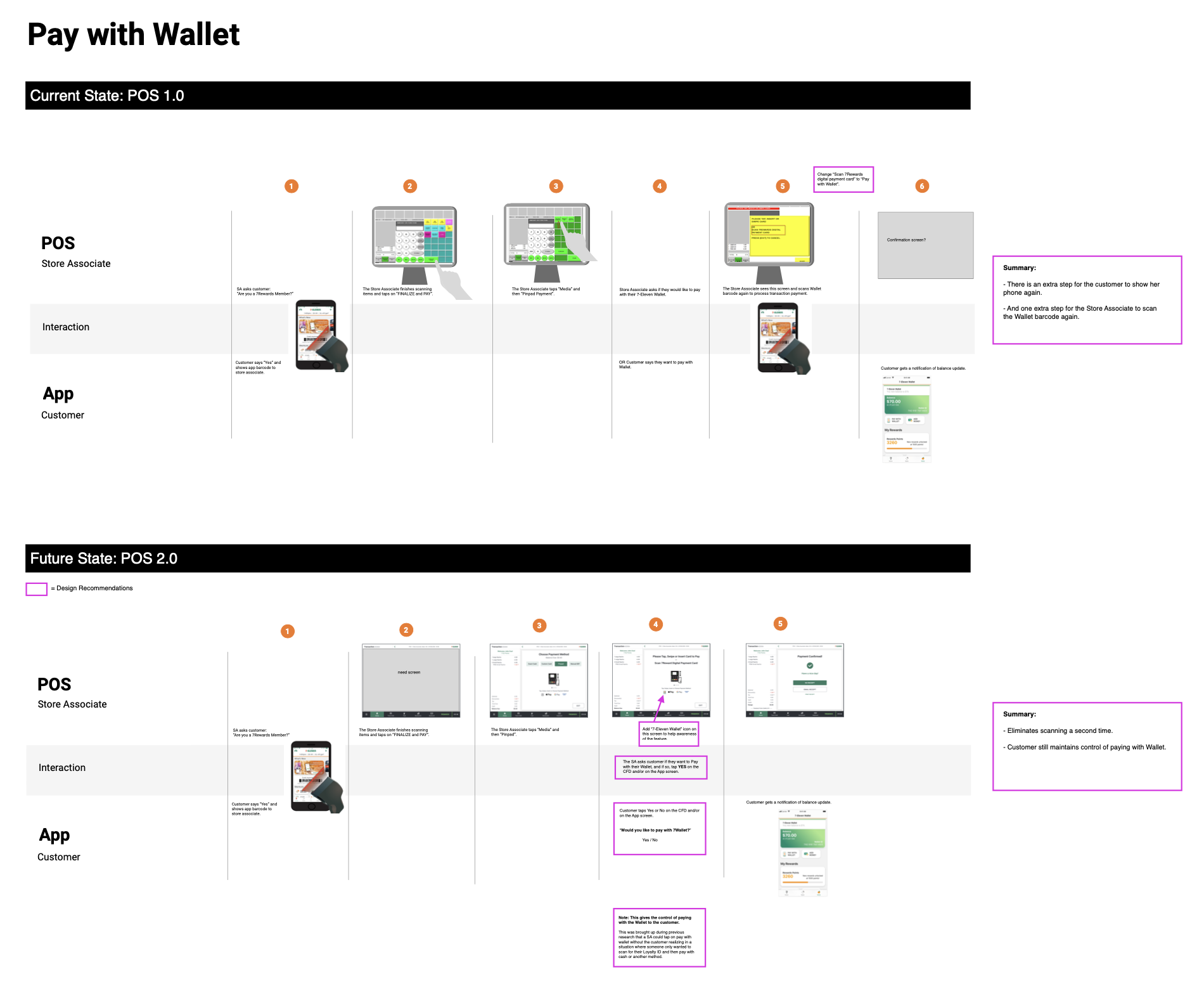
Current and Future states of the store systems and the customer app screens.
Confusion Over Funding Method
Research goal: Conduct usability testing during our soft launch
Method: Live app on team members' OS and Android phones
Results: Confusion on what payment method was used to fund wallet: User didn't notice funding method dropdown at the bottom of the screen while reloading their Wallet.
Design Changes: I moved the task of selecting the funding method to the first step, on its own screen. Then I added the selected funding method to the top of the next screen to make it more prominent. These changes tested well with users.
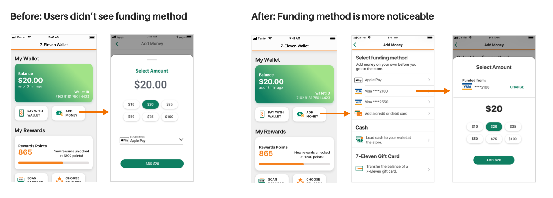
Before and After: Select funding method flow.
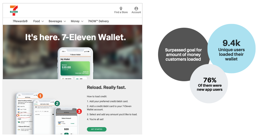
The Outcome
The 7-Eleven Wallet had its nationwide launch on November 9, 2020. It was deemed a success by stakeholders.
We surpassed our goal for the amount of money loaded to the wallet, and also increased new app users (76% of those Wallet users were new to the app).