Project Details
Goal: Redesign the kw app, kw.com, and the kw agent sites.
The Team: Three internal KW designers and four designers from an outside agency
My Responsibilities: Visual design, competitive research, information architecture, interaction design, prototyping, contributing to our design system, and UX writing
Timeline: Approximately four months
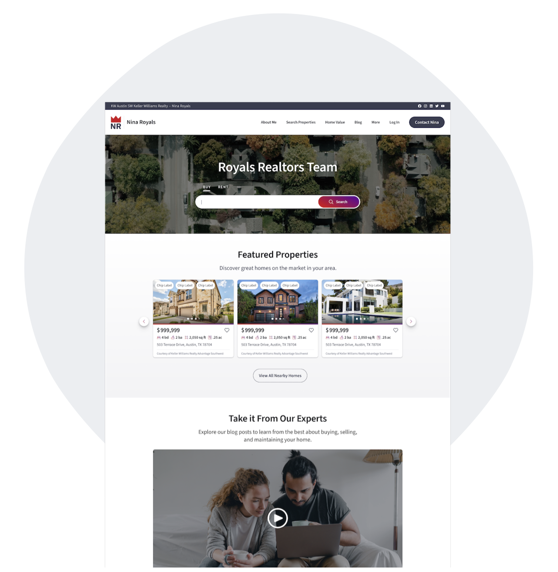
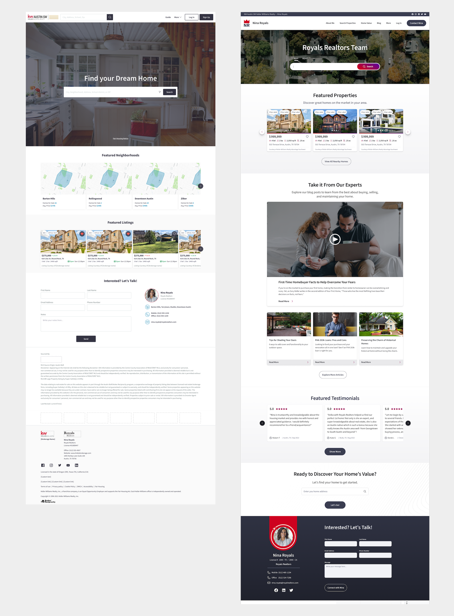
Redesigned Agent Site
The Problem
Our website, app, and
agent sites lacked features that the competition had, plus they
were visually a little dated. Agent sites did not offer enough tools to help
them generate leads or to add articles or videos to their websites.
The Process
The design team was comprised of three KW designers and
four agency designers. We broke up into teams comprised of one KW designer and one agency designer.
Each team tackled the redesign of one main feature.
Some of My Work From the Project
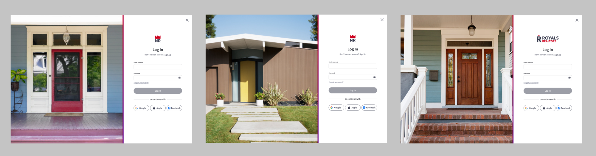
Sign Up and Log In
Designs for the new sign up and log in screens for kw.com in various breakpoints.
The photography I selected reflected the theme of being happy at home.
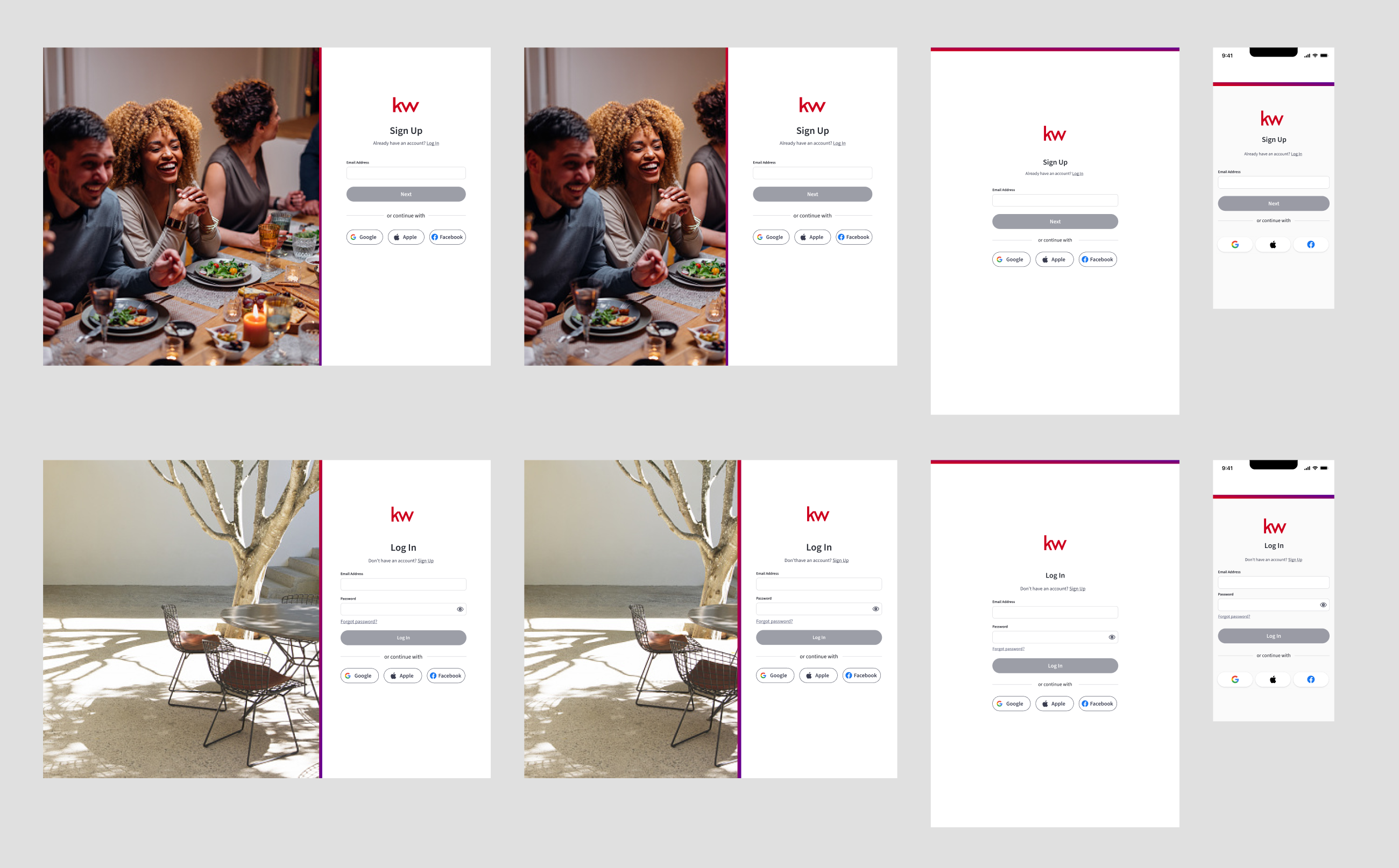
For the agent sites, the design was similar to kw.com, but showed a variety of home entrances.
The idea was that a selection of photos would be curated for the agents to choose from when they set
up their website.
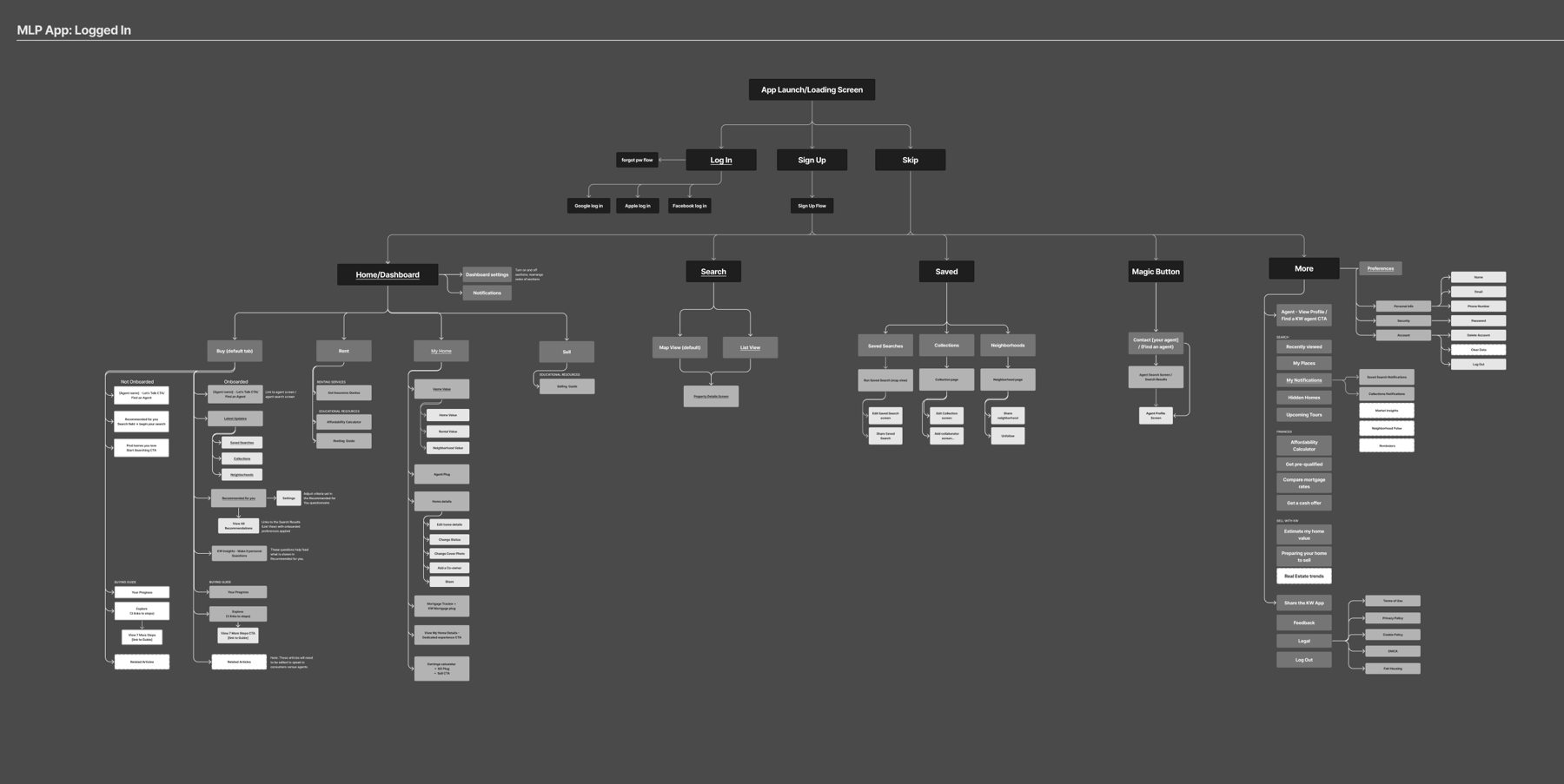
App and Site Maps
I created site maps for the app,
kw.com, and agent sites. I kinda love doing site maps.
For each section of the maps, I
added links to its corresponding epic in Jira,
and links to the hand-off design files in Figma.
Product managers liked having this overview and the quick links.
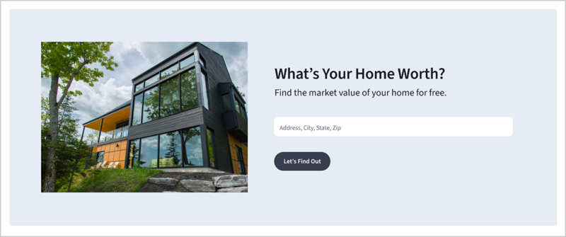
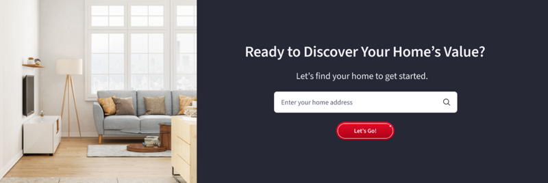
Agent Sites Module
I designed a home valuation sign up module on the agents site
that would be used as a lead generation tool.
I used photography of bright interiors and beautiful exteriors to
reflect our new visual direction.
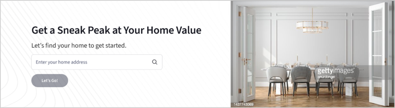
Ha! I noticed a typo while putting this page together. This should say, "peek", not "peak"!
Feature Onboarding
We tackled how to best do feature onboarding. I researched best practices
and started a guide that outlined different methods that we could use as a team going forward.
Based on what type of guidance we should use (like proactive, reactive, or on-demand), and under what
circumstance the user might need guidance, I included what type of UI pattern we could use, and added some example content.
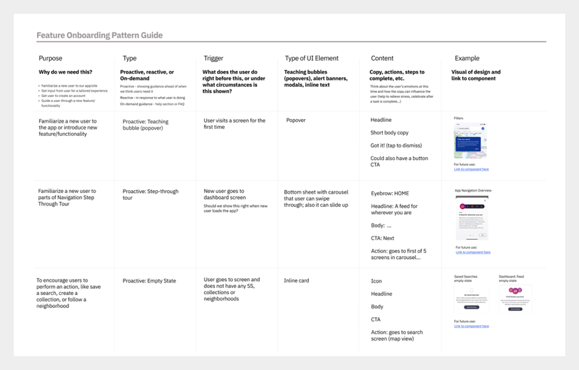
Feature Onboarding Pattern Guide
Photo Selection
Reflecting the company's
goals surrounding diversity and inclusivity, I curated a collection of
photos to use in our re-design that fit into our new visual direction
and that also conveyed a sense of family and joy in home ownership.
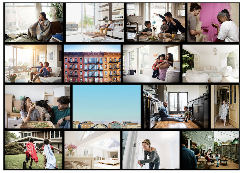
Some of the photos in the collection I created for our re-design
Some Design Issues
Unfortunately due to the team breaking out into various small teams, designs were being created in silos.
One of the agency designers designed lovely new property cards, but when real data was put into the designs
it caused the design to “break”.
The listing price had to be displayed in the currency where the property was located,
so the card had to accomodate the shifting sizes of different currencies.
As the designer who had been
there the longest I had domain knowledge of some constraints that I knew we had to take into account, like
real estate compliance rules and translation spacing issues, so I worked with the agency designer to
redesign the cards to take these into account.
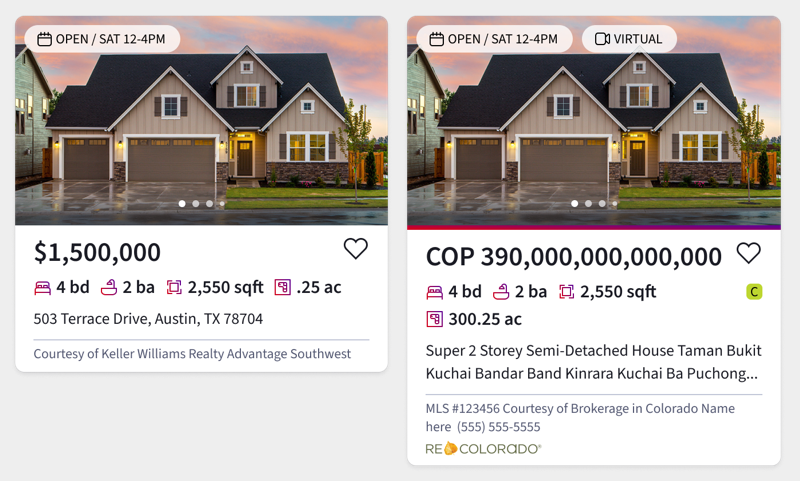
Happy path version on the left. The version on right I called "The Everything Bagel".
Contributing to Our Design System
I worked on our design system with the other two Consumer designers.
We had working sessions once a week to introduce new additions to our design system and
identify opportunities for improvement.
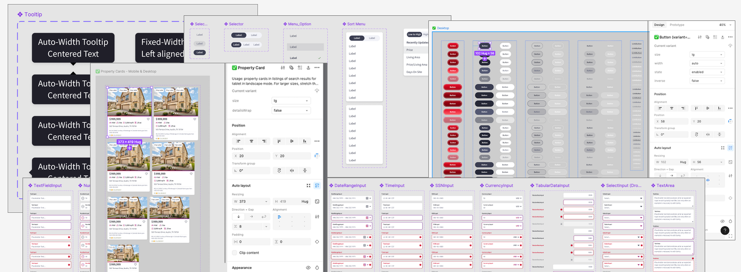
Screenshot of parts of our design system
Property Search Filters
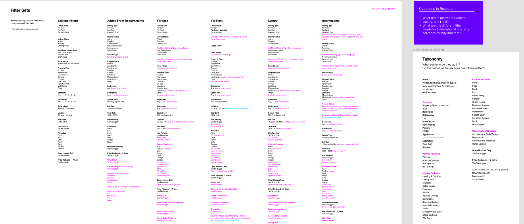
An overview of my filters list
I worked on the information architecture and taxonomy of our
filters for property search. Product only required a handful of new filters to add to our
set, but I wanted to dig deeper and offer suggestions based on what I knew users wanted
from prior user research and studying the competition.
I met with our data engineers to learn what data we could possibly filter on,
which was a ton of stuff! From there I created a spreadsheet (and a prettier document for presenting) of
recommendations of what filters to add, classified into logical groupings.
The Outcome
At our yearly agent conference
in February, our Product Managers showed demos of the new agent site and it was very
well received. Agents were excited about the new look and feel, plus added the functionality.
Unfortunately I was a part of a round of layoffs and left in April 2023 while the team continued to work on the
redesign.
Agent sites before and after
Lessons Learned
During the three month re-design project, we created the design system as we were designing, and didn't have time to get a
consensus on which styles to use as the final version to add to our design system. Also, we only had time to do the happy path, so when it came time to hand off to developers,
we had to scrambled to quickly churn out designs for all the different use cases.
In hindsight...
After the agency’s engagement was over, I would have pushed even more that we needed a sprint or two to clean up design debt
and to make sure each set of designs had all its various use cases.
I would have also conveyed more strongly the team consensus that we couldn’t work at the same velocity as we did when
the agency was engaged with us.