Details
Goal: Improve patient experience and increase conversion
The Team: One UX designer (me) and one UI designer. Sometimes a UX researcher.
My Responsibilities: UX wireframes, competitive research, information architecture, prototyping, UX writing
Timeline: Various projects over approximately one year

Selected Project
Fixing a Frustrating Patient Experience
Patients were surprised and frustrated when they arrived at a
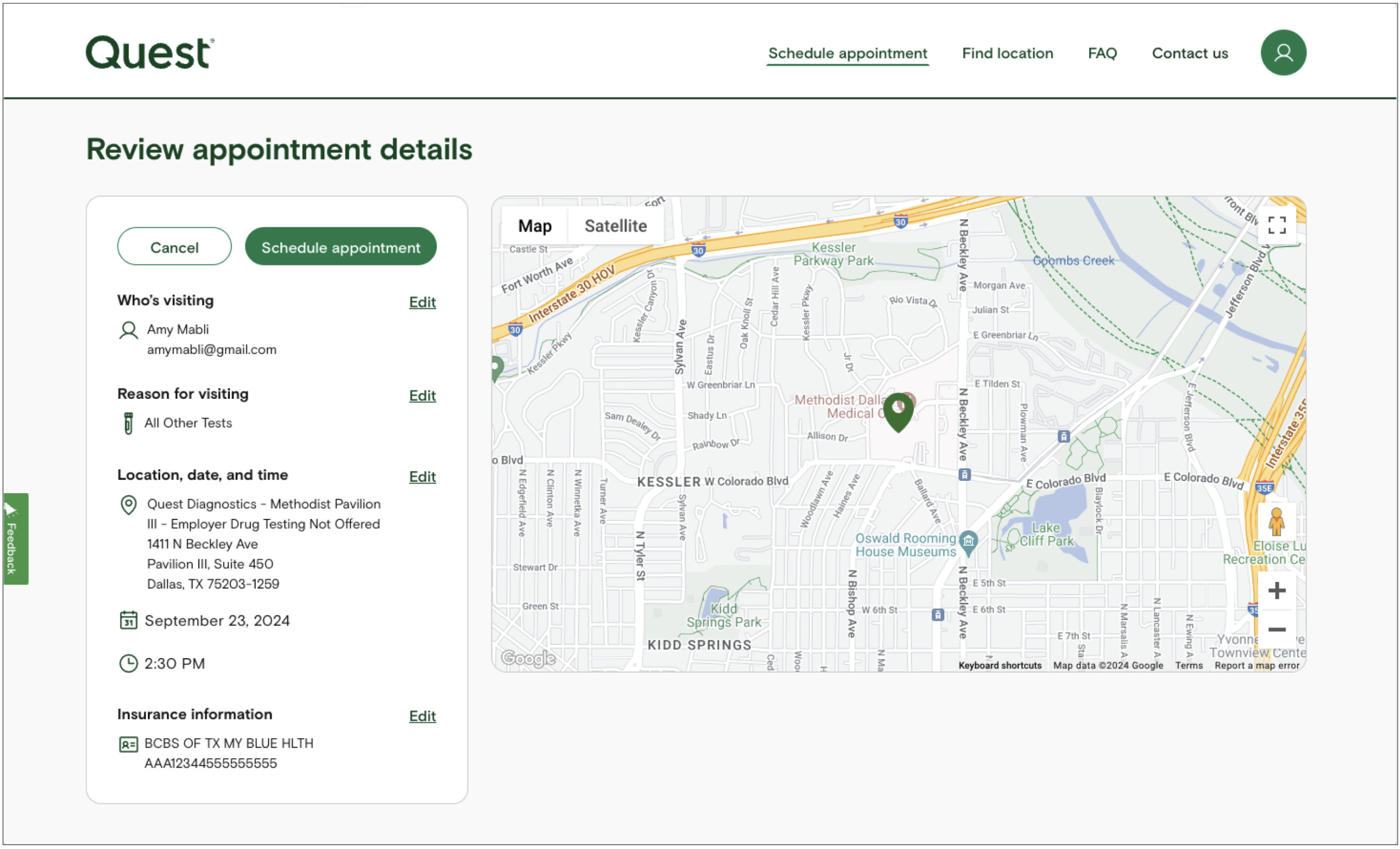
Patient Service Center and found out they didn't have an appointment. The problem was our Review screen. The language and the map on the screen
made patients think they were done with the flow. They were supposed to click on the Schedule appointment button as the final step to book their appointment, but they had stopped at this screen.
Patients were showing up with this screen below printed out believing that they had an appointment, but they hadn't actually completed the booking process.

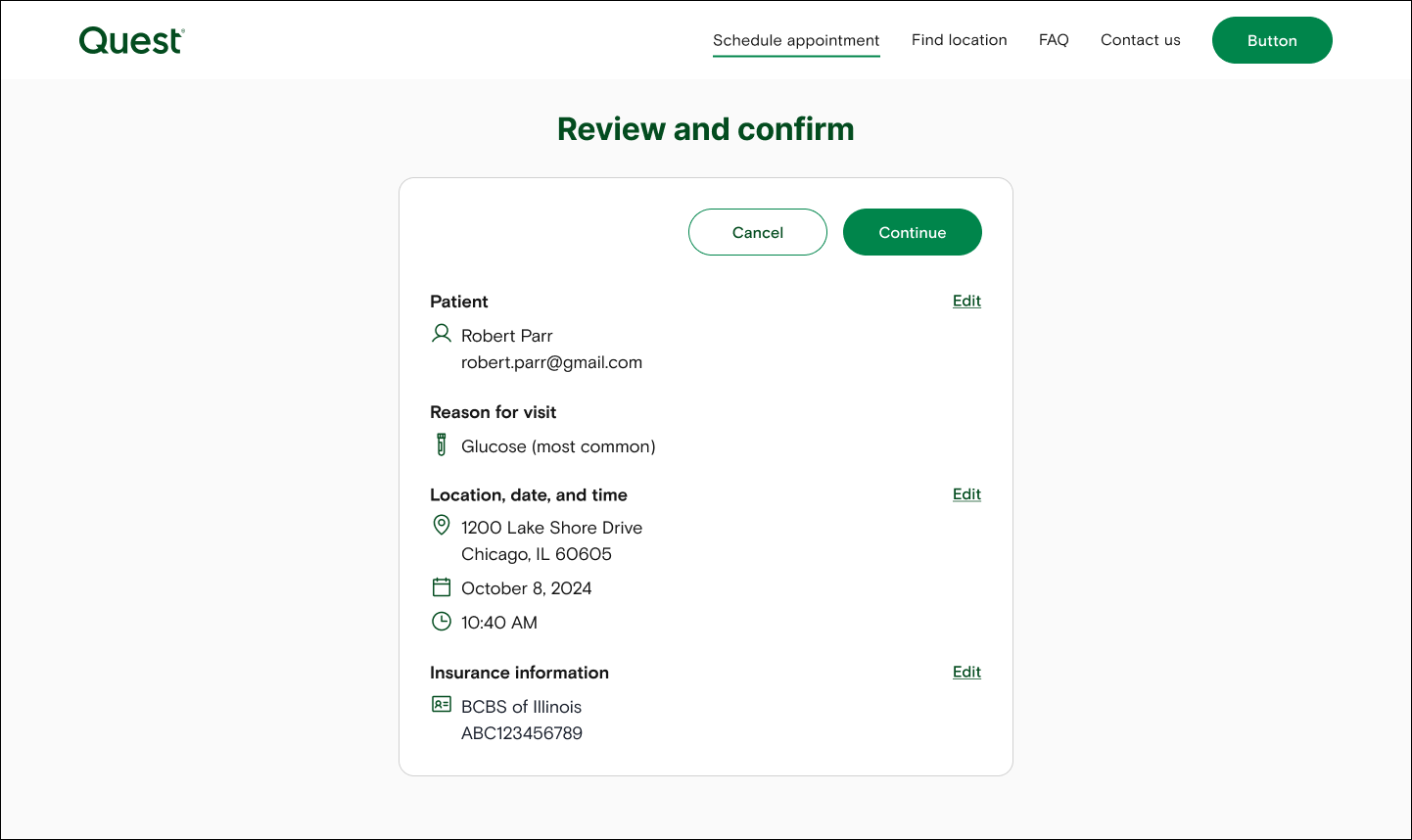
Redesigned Review Screen
I worked on revisions for the screen to make it clearer to the patients that they weren't done at this screen, but had to click on the button to book the appointment.
I put together a rapid brainstorm session with the team to come up with ideas for improved verbiage. We settled on 5 designs to test.
The one below tested the best.
After releasing this new design, our conversion rate increased for appointment confirmation from 83.9% to 97.5% within a month of launch.

More examples of my work for Quest coming soon.